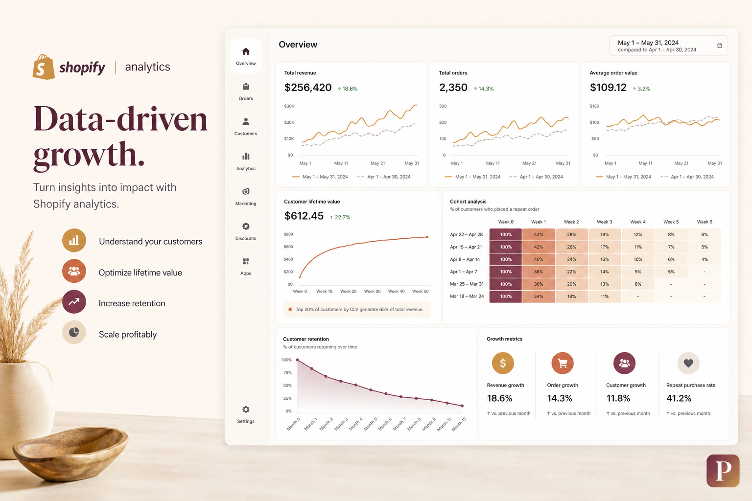
Shopify Analytics & Data-Driven Growth: The Metrics Playbook for US & UK D2C Brands (2026)
Why Gut Feel Dies at Scale
Here's a scenario every D2C operator knows. You run Facebook ads. Sales look decent. You're not sure if you're actually profitable on a per-customer basis, but the top-line revenue is growing, so you scale spend. Six months later, cash is tight. You pull back on ads. Revenue drops. Panic sets in.
This is what happens when you fly without instruments. In 2026, US D2C customer acquisition costs average $45-85 across categories. In the UK, £30-65. If you don't know your blended CAC down to the penny, your LTV by cohort, and your payback period by channel, you're essentially betting the business on a feeling. The brands that survive and thrive are the ones that treat analytics as their operating system — not as a monthly report they skim.
1. Shopify Analytics: Your Native Command Center
Before you add any third-party tools, master what Shopify gives you for free. The native analytics dashboard has matured significantly and is the fastest path to actionable insights for stores doing under $5M in revenue.
Key Reports Every D2C Brand Should Review Weekly
- Sales over time: Revenue, orders, and AOV trends. Set your comparison period to the prior week and prior year. Spot anomalies immediately — a Tuesday dip that repeats every week deserves investigation.
- Sales by product: Identify your 80/20. In most D2C catalogs, 20% of SKUs drive 80% of revenue. These are the products you optimize everything around — ads, email flows, homepage real estate.
- Sales by traffic source: Shopify's attribution isn't perfect, but the relative trends are invaluable. If organic is growing 15% month-over-month while paid is flat, reallocate budget accordingly.
- First-time vs. returning customer sales: This ratio tells you whether you're building a brand or just arbitraging attention. Healthy D2C brands in the US and UK target 25-40% returning customer revenue. Below 20% and you're over-reliant on acquisition.
- Average order value (AOV): Track it weekly. A declining AOV means your discounting is eroding margins or your mix is shifting toward lower-priced products. Neither is good unless intentional.
- Customer cohort report: Shopify's built-in cohort analysis shows retention by the month of first purchase. If month-3 retention is below 15%, your post-purchase experience needs work.
The beauty of Shopify Analytics is speed. You can answer 70% of operational questions — "Which channel drove the most new customers last month?" — in under 30 seconds without leaving the admin. Master this before you layer on anything else.
2. GA4 Integration: The Full-Funnel View
Shopify Analytics tells you what happened on your store. Google Analytics 4 tells you what happened before, during, and after. Together, they give you the complete picture.
Setting Up GA4 for Shopify Properly
Most Shopify stores have GA4 installed — and most have it configured incorrectly. Here's what a proper setup looks like:
- Enhanced Ecommerce events: view_item, add_to_cart, begin_checkout, purchase. These must fire on every relevant action. Use Google Tag Manager or a Shopify app like Littledata to ensure accuracy. Without these, your funnel analysis is blind.
- UTM discipline: Every ad, every email, every influencer link must carry UTMs that follow a consistent naming convention. Source / Medium / Campaign / Content. No exceptions. Inconsistent UTMs create garbage data, and garbage data leads to garbage decisions.
- Cross-domain tracking: If you run a separate blog, landing pages, or a subscription portal on a subdomain, configure cross-domain tracking in GA4. Otherwise, a customer who reads your blog and then buys looks like two different users in your reports.
- Referral exclusions: Exclude Shop Pay, PayPal, Klarna, and any payment gateway domains. Without exclusions, every checkout that redirects to a payment processor and back counts as a new session — inflating your session count and tanking your conversion rate.
- Audience definitions: Build GA4 audiences for purchasers, high-intent visitors (3+ page views), cart abandoners, and lapsed customers. These feed directly into Google Ads for remarketing.
The GA4 Reports That Matter for D2C
| Report | What It Tells You | Action |
|---|---|---|
| Traffic acquisition | Which channels bring users who actually buy, not just click | Shift budget to channels with the highest purchase conversion rate, not the lowest CPC |
| Ecommerce purchases (item-level) | Which products sell together — natural bundles | Create product bundles, upsell offers, and email flows around natural pairs |
| Funnel exploration | Drop-off rates at each stage: PDP → ATC → checkout → purchase | Identify the steepest cliff and focus optimization there |
| User lifetime (LTV report) | Revenue per user by acquisition month | Validate CAC payback assumptions; compare cohorts |
| Path exploration | The actual pages users visit before purchasing | Optimize the common paths, not the paths you assume users take |
3. Cohort Analysis: The Growth Diagnostic
Cohort analysis is the single most underused analytics technique in D2C — and the one that separates sophisticated operators from everyone else. A cohort is a group of customers who share a common characteristic, usually the month they made their first purchase.
Why Cohorts Beat Aggregate Metrics
Your overall customer LTV might be $120. That number is useless. It averages together customers from January 2024, when your product was different, with customers from June 2026, who came through a different channel and paid a different price. Cohorts show you the trend — are recent cohorts performing better or worse than older ones? If November 2025's cohort has 40% lower LTV than March 2025's, something changed. Maybe you ran a aggressive discount campaign that attracted one-time bargain hunters. Maybe your product quality dipped. Cohorts surface these signals before they show up in aggregate revenue.
Building a Cohort View
Shopify's native cohort report is a good starting point. For deeper analysis, export your order data and build a retention matrix in Google Sheets or a BI tool:
- Group customers by first purchase month.
- Calculate the percentage who make a second purchase in each subsequent month.
- Track average order value and cumulative revenue per cohort over time.
The goal isn't just to measure retention — it's to identify when cohorts break. If month 4 is consistently your drop-off cliff, you need a reactivation campaign timed at day 100-110. If cohorts acquired from TikTok have half the retention of cohorts from Google Search, you adjust your channel mix or your TikTok landing page experience.
For US and UK brands, a healthy cohort retention curve looks like: ~25-30% month-2 retention, ~18-22% month-3, and stabilizing around 10-15% by month 6. Anything below these benchmarks signals a leaky bucket — you're pouring water in faster than you're losing it, but only just.
4. Customer Lifetime Value: The Metric That Rules Them All
LTV is the north star of D2C growth. If you know your LTV accurately, you can answer every strategic question: how much you can pay to acquire a customer, which channels are worth scaling, and whether you're building an asset or burning cash.
Calculating LTV Properly
There are two approaches, and you should use both:
- Historical LTV: Sum of all revenue from a cohort divided by the number of customers in that cohort. Simple. Backward-looking. Best for mature cohorts (6+ months old).
- Predictive LTV: Use a probabilistic model based on recency, frequency, and monetary value to forecast what a customer will spend over their lifetime. Tools like Triple Whale and Northbeam do this automatically. For a DIY approach, the BG/NBD (Beta-Geometric / Negative Binomial Distribution) model is the industry standard and can be implemented in Python with the lifetimes library.
The formula for a quick LTV estimate: LTV = AOV × Purchase Frequency × Average Customer Lifespan. If your AOV is $65, customers buy 2.3 times per year on average, and the average customer stays active for 2.1 years: LTV = $65 × 2.3 × 2.1 = $313.95.
US vs. UK LTV Benchmarks (2026)
| Category | US LTV Benchmark | UK LTV Benchmark |
|---|---|---|
| Skincare & Beauty | $280-450 | £200-340 |
| Apparel & Fashion | $220-380 | £170-290 |
| Health & Wellness (supplements) | $340-600 | £250-440 |
| Home & Kitchen | $180-320 | £140-250 |
| Pet | $300-520 | £220-380 |
| Food & Beverage (subscription) | $400-750 | £300-550 |
These are benchmarks, not targets. Your LTV depends on your price point, product category, and retention strategy. The key is the trend: is your LTV growing quarter over quarter? If not, your business isn't getting healthier — it's treading water.
5. CAC Payback: The Growth Brake Pedal
CAC payback is the number of days it takes for a customer to generate enough gross profit to cover their acquisition cost. A shorter payback period means you can reinvest faster and scale harder. A longer one means you're financing growth with working capital — dangerous if cash runs tight.
The CAC Payback Formula
CAC Payback (days) = (CAC ÷ Monthly Gross Margin per Customer) × 30.
Example: You spend $55 to acquire a customer (blended across all channels). Your AOV is $70, gross margin is 65%, so gross profit per order is $45.50. If the average customer buys 1.0 times in their first month, monthly gross margin per customer is $45.50. Payback = ($55 ÷ $45.50) × 30 = 36 days.
What's a Good Payback Period?
- Under 60 days: Excellent. You're in a position to scale aggressively.
- 60-120 days: Manageable. Growth requires some working capital, but the unit economics work.
- 120-180 days: Caution zone. You're financing growth. Make sure you have the cash reserves.
- Over 180 days: Unsustainable. Either CAC is too high, margins are too thin, or repeat purchase rate is too low.
Track payback by channel, not just blended. Facebook might pay back in 45 days while TikTok takes 110. That's critical information for budget allocation. A channel with a 110-day payback might still be worth it if those customers have higher LTV — but you need to know the full picture to make that call.
6. RFM Segmentation: Know Your Customers
RFM — Recency, Frequency, Monetary value — is the simplest and most powerful customer segmentation framework in D2C. It answers the question every brand must answer: "Who are my best customers, and how do I get more of them?"
How RFM Works
Score every customer on three dimensions (each on a 1-5 scale, with 5 being best):
- Recency: How recently did they purchase? Customers who bought last week (R=5) are far more likely to buy again than customers who bought 6 months ago (R=1).
- Frequency: How often do they purchase? A 5-time buyer (F=5) is more valuable — and more responsive to marketing — than a 1-time buyer (F=1).
- Monetary: How much do they spend? High-AOV customers (M=5) deserve VIP treatment.
Combine the scores into segments. A customer with R=5, F=5, M=5 is a champion — your best customer. They should receive exclusive early access, premium support, and loyalty rewards. A customer with R=1, F=1, M=3 is a lost, one-time moderate spender — they need a win-back offer or you should stop spending money trying to reactivate them.
RFM Segments and Actions
| Segment | RFM Profile | Strategy |
|---|---|---|
| Champions | R=4-5, F=4-5, M=4-5 | VIP program, early access, referral incentives. They're your highest-LTV customers — reward them. |
| Loyal Customers | R=3-5, F=3-4, M=3-5 | Subscription upsell, loyalty points, new product previews. Keep them engaged between purchases. |
| Potential Loyalists | R=4-5, F=1-2, M=2-4 | Second-purchase discount, onboarding sequence, product education. Turn their enthusiasm into habit. |
| At-Risk | R=1-2, F=3-5, M=3-5 | Reactivation email flow, personalized offer. They used to love you — win them back before they're gone for good. |
| Lost | R=1, F=1-2, M=1-2 | Minimal investment. One final win-back email, then suppress from paid campaigns. |
You can run RFM segmentation manually in Google Sheets using pivot tables, or use tools like Peel Insights, Glew, or the RFM features built into Klaviyo and Triple Whale. The important thing is to use the segments in your marketing automation, not just admire them in a report.
7. Retention Curves: The Shape of Your Business
A retention curve is a graph that plots the percentage of customers who remain active over time. It's the single most honest representation of whether your product delivers lasting value or just novelty.
Reading the Curve
Every D2C retention curve has a characteristic shape. In the first 1-3 months, retention drops steeply — this is normal. Customers who bought on impulse, didn't like the product, or forgot about you churn out. The question is what happens after month 3. Does the curve flatten at 10%? 15%? 25%? That flat portion is your core customer base — the people who genuinely value your product.
Here's what different shapes tell you:
- Steep drop then flat at <10%: You have a product problem or an expectation mismatch. Customers try once and don't come back. Fix the product or fix the marketing promise.
- Steep drop then flat at 15-25%: Healthy for most D2C categories. You have a core base of repeat buyers. Your job is to expand it.
- Gentle decline throughout: You don't have a core. Every customer eventually churns. This is common for one-time purchase categories, but for consumables or subscription-eligible products, it's a red flag.
- Flat at >30%: Exceptional. Your product is sticky, your experience is strong. You can afford to spend more on acquisition because you'll earn it back over a long customer lifetime.
Build retention curves by acquisition channel too. Customers from organic search often retain 30-50% better than customers from paid social because they came with intent. This doesn't mean kill paid social — it means you need to account for the LTV difference when setting CAC targets by channel.
8. Triple Whale vs. Northbeam: The Attribution Battle
For D2C brands spending $50K+ per month on ads, Shopify's native attribution and GA4's last-click model aren't enough. You need a dedicated attribution platform. Triple Whale and Northbeam are the two dominant players in 2026, and they approach the problem differently.
Triple Whale
Triple Whale's core product, the Triple Pixel, is a server-side tracking pixel that captures every touchpoint in a customer's journey. It uses a proprietary attribution model that blends first-click, last-click, and multi-touch data into a single "Triple Whale Attributed" metric. The platform also provides:
- Summary page: A one-screen dashboard with revenue, ad spend, ROAS, CPA, and LTV across all channels. The "North Star" of Triple Whale — designed for founders who want the answer in 10 seconds.
- Customer journey timelines: See every ad a customer clicked, every email they opened, and every page they visited before buying.
- Creative reporting: Performance breakdowns by ad creative, not just ad set. Crucial for creative-heavy strategies.
- RFM and LTV dashboards: Built-in segmentation and cohort analysis.
Best for: Brands spending $50K-$500K/month on paid media who want an all-in-one dashboard with strong creative analytics. Triple Whale excels at answering "which ads are driving results right now?"
Northbeam
Northbeam takes a different approach. Instead of pixel-based tracking, Northbeam builds a machine learning model trained on your actual order data. It uses a media mix modeling (MMM) approach combined with multi-touch attribution to estimate the incremental contribution of each channel:
- Incrementality testing: Northbeam's core differentiator. It quantifies how many conversions each channel actually caused — not just which ads users clicked before buying. This is critical because users who click Facebook ads were often going to buy anyway.
- Geo-lift testing: Turn off ads in specific geographic regions and measure the actual revenue difference. The gold standard for measuring incrementality.
- Forecasting: Revenue projections based on historical trends and planned ad spend.
- Cleaner data model: Because Northbeam ingests server-side data directly, it's less affected by iOS privacy changes and cookie restrictions.
Best for: Brands spending $200K+/month who need rigorous incrementality measurement and are sophisticated enough to act on it. Northbeam answers "are my ads actually creating new revenue, or just claiming credit for customers who would have bought anyway?"
A Side-by-Side Comparison
| Feature | Triple Whale | Northbeam |
|---|---|---|
| Attribution method | Triple Pixel (server-side + ML blend) | ML-driven MMM + multi-touch |
| Pricing (2026) | $299-799/month | $800-2,500+/month |
| Best revenue range | $1M-$10M annual | $5M-$50M+ annual |
| Core strength | Speed and usability — answers in seconds | Incrementality — distinguishes causation from correlation |
| Creative analytics | Excellent — creative-level breakdowns | Moderate — focuses more on channel mix |
| RFM / LTV | Built-in | Available but less central to the UX |
| Geo-lift testing | Not available | Built-in |
| Learning curve | Low — designed for founders | High — designed for analysts and growth teams |
Many brands run both: Triple Whale for daily operational decisions and creative reporting, Northbeam for quarterly incrementality validation and board-level reporting. If you can only afford one, pick based on your question. If you need to know "which ads are working?" — Triple Whale. If you need to know "is any of this actually working?" — Northbeam.
9. Building a Growth Dashboard That Actually Gets Used
Most dashboards are expensive wallpaper. They get built, admired once, and never opened again. A dashboard that drives decisions has three properties:
1. It Answers One Question Per Screen
Don't cram 47 metrics onto a single page. Build separate views:
- Daily health check: Revenue vs. target, sessions, conversion rate, AOV, ad spend, blended ROAS. The 30-second scan every morning.
- Weekly growth review: New customers by channel, CAC by channel, CAC payback, LTV by cohort, retention curves. The 30-minute deep dive every Monday.
- Monthly board report: Revenue, gross margin, contribution margin after marketing, customer count, LTV:CAC ratio, month-over-month and year-over-year growth rates.
2. It Shows Trends, Not Just Snapshots
A number in isolation is meaningless. $50,000 in revenue yesterday — is that good? The dashboard must show the comparison: vs. prior week, vs. prior month, vs. same month last year. Every metric should have a directional arrow — green up, red down, with the percentage change.
3. It's Connected to Action
Every metric on the dashboard should trigger a specific response. If 7-day retention drops below 20%, the team knows exactly which email sequence to audit. If CAC crosses $60, there's a meeting about channel reallocation. If AOV dips 10%, there's a promo audit. No metric without an owner, no owner without a response protocol.
Recommended Dashboard Tools for Shopify
- Triple Whale (all-in-one): Best for brands wanting a pre-built D2C dashboard with minimal setup. $299+/month.
- Google Looker Studio (free): Connect Shopify and GA4 data via connectors like Supermetrics or Porter Metrics. Flexible, free, requires setup.
- Peel Insights: Focused on retention, RFM, and cohort analysis. Best paired with another tool for attribution.
- Metabase or Lightdash (open-source): For brands with a data warehouse. Query your own data in SQL, build custom dashboards. Highest flexibility, highest setup cost.
10. Data-Driven Decision Making: Building the Culture
Tools and dashboards are worthless without a culture that uses them. Here's what data-driven D2C brands do differently:
They Start Every Meeting with Numbers
Marketing meeting? Open with yesterday's revenue, CAC, and ROAS. Product meeting? Open with NPS, return rate, and product-level LTV. Creative review? Open with thumb-stop rate, CTR, and conversion rate per creative. When data leads the conversation, opinions follow the evidence instead of the loudest voice in the room.
They Set Metric-Based OKRs
Not "improve retention" — that's a wish. "Increase month-3 customer retention from 18% to 24% by Q2 through a post-purchase email sequence and subscription program." That's a goal. Every OKR has a number, a timeframe, and a hypothesis about what will move the number.
They Democratize Data Access
Every team member who makes decisions — marketing managers, product developers, customer support leads — should have access to the dashboards relevant to their function. When a customer support agent can see that a customer has $800 in lifetime value, they treat that ticket differently. Data isn't a secret guarded by the analytics team; it's the shared language of the company.
They Use the "So What?" Test
Before presenting any data, ask: "So what? What decision changes based on this number?" If the answer is "nothing changes no matter what the number says," delete the metric from your dashboard. Every data point you track should have a direct line to a business decision. If mobile conversion rate drops, you investigate the checkout flow. If LTV rises, you increase CAC targets. No metric without a "so what."
US vs. UK: Analytics and Benchmark Nuances
| Metric | US Benchmark | UK Benchmark | Note |
|---|---|---|---|
| Average ecommerce conversion rate (D2C) | 1.5-2.5% | 1.8-2.8% | UK consumers slightly more likely to convert, driven by higher trust in established brands and stronger consumer protection laws |
| Customer acquisition cost (blended) | $45-85 | £30-65 | UK CAC is structurally lower due to smaller market and less competitive auction dynamics |
| Average order value (D2C) | $65-95 | £45-75 | US consumers consistently spend more per order; UK consumers are more price-sensitive |
| Monthly retention (month 2) | 20-28% | 22-30% | UK customers show marginally higher loyalty to D2C brands once acquired |
| Mobile share of traffic | 65-70% | 70-75% | UK mobile penetration higher; mobile UX optimization is even more critical |
| Returns rate | 15-25% (fashion); 5-10% (other) | 20-30% (fashion); 8-12% (other) | UK consumers return more — factor this into your unit economics when expanding |
| Email/SMS opt-in rate | 2-5% (popup) | 2-4% (popup) | GDPR in the UK requires explicit consent; US opt-in rates marginally higher due to different privacy norms |
| Subscription take rate | 8-15% of customers | 10-18% of customers | UK consumers show higher adoption of subscription models, particularly in beauty and food |
The differences are real but not dramatic. The fundamentals of data-driven growth — know your unit economics, segment your customers, and measure incrementality — apply equally on both sides of the Atlantic. The benchmarks shift, but the playbook doesn't.
The Bottom Line
Data-driven growth isn't about having more dashboards than the competition. It's about having fewer, better questions — and the discipline to answer them honestly, consistently, and every single week.
Here's the simplest possible data-driven growth system for a D2C brand on Shopify:
- Every morning: Open Shopify Analytics. Scan revenue, sessions, conversion rate, AOV. 30 seconds.
- Every Monday: Open your growth dashboard. Review new customers by channel, CAC by channel, and LTV by cohort. Compare to last week and last month. 30 minutes.
- Every month: Run a full cohort analysis. Are retention curves holding? Is LTV growing? Is CAC payback within your target range? Update your channel budgets accordingly. 2 hours.
- Every quarter: Run incrementality testing. Is your attribution telling the truth? Are your paid channels actually creating incremental revenue? Adjust attribution models and budgets based on findings. 1 day.
The brands that win in 2026 and beyond won't be the ones with the biggest ad budgets or the most creative content. They'll be the ones that know their numbers cold, make decisions from data instead of intuition, and build the operational discipline to do it week after week after week. The tools are available. The benchmarks are here. The only missing piece is consistency — and that's on you.
Ready to Build Your Data-Driven Growth Engine?
I help US and UK D2C brands set up analytics infrastructure, build growth dashboards, and implement the measurement frameworks that turn data into revenue. From GA4 setup to full-funnel attribution to cohort analysis — let's build the system that tells you exactly where your next dollar of growth should come from.
Last updated: August 2026 | Author: Pravesh | pravesh.online