Shopify Checkout Optimization: The D2C Guide to Reducing Abandonment for US & UK Brands (2026)
Why Checkout Abandonment Is Costing You More Than You Think
Let's put some numbers behind the problem. If your store gets 50,000 monthly sessions at a 2% conversion rate, you're getting 1,000 orders. But your cart-to-checkout rate might only be 45%, and your checkout completion rate sits at 55%. That means 4,500 people start checkout each month but only 1,000 finish it. At a $65 average order value, that's $227,500 in monthly revenue that walked away — not because your product is bad, but because your checkout experience leaked.
Baymard Institute's latest research shows the average checkout has 14.88 form fields. The ideal? Seven to eight. Every extra field you demand from a customer chips away at their motivation to complete the purchase. Now layer on slow page loads, missing payment methods, vague shipping timelines, and no trust signals — and you've built a checkout that actively repels revenue.
The good news: Shopify's checkout infrastructure in 2026 is the most powerful it has ever been. Between Shop Pay's one-tap checkout, checkout extensibility on Plus plans, native address autocomplete, and deep payment method customization, D2C brands have more levers to pull than at any point in ecommerce history. The question is whether you're pulling them.
The Anatomy of a High-Converting Shopify Checkout
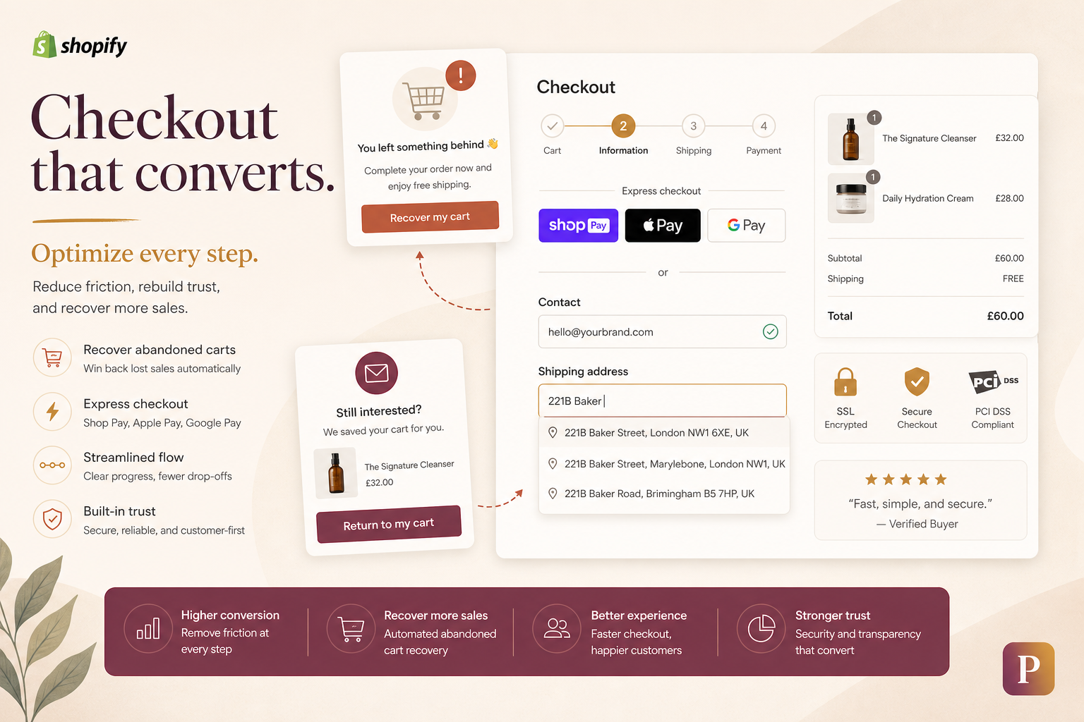
Before diving into tactics, understand the structure. A checkout page isn't one thing — it's a sequence of micro-decisions the customer makes. Each one is a friction point or a trust builder:
- Contact information: Email or phone. First decision: "Do I trust this brand with my data?"
- Shipping address: Typing out a full address on mobile. Painful without autocomplete.
- Shipping method: How fast? How much? This is where hidden costs kill conversions.
- Payment: Do they see their preferred method? Is express checkout available?
- Review & confirm: The final check. Trust badges, return policy, and price transparency seal the deal — or break it.
Every element below targets one or more of these stages.
1. Express Checkout: Shop Pay, Apple Pay, and Google Pay
This is the single highest-ROI change you can make to your Shopify checkout. Express checkout options — Shop Pay, Apple Pay, Google Pay, and PayPal — bypass the traditional form-filling experience entirely. The customer taps a button, biometric authentication confirms their identity, and their saved payment and shipping details are auto-populated. Three seconds versus three minutes.
Shop Pay: The US Powerhouse
Shop Pay is Shopify's native accelerated checkout, and in the US market, it's dominant. Shopify reports that Shop Pay checkouts convert at 1.72x the rate of regular checkout. For US D2C brands, Shop Pay can account for 30-40% of total checkouts — it's not an optional feature, it's table stakes. Shop Pay stores customer shipping and payment information across any Shopify store, meaning repeat shoppers on the Shopify ecosystem can check out in under 10 seconds. If you're a US brand and Shop Pay isn't enabled, you are leaving a significant chunk of revenue on the table.
Apple Pay and Google Pay: Mobile Conversion Engines
With mobile traffic now accounting for 65-75% of D2C sessions in both the US and UK, Apple Pay and Google Pay are non-negotiable. Apple Pay, in particular, converts at 2-3x the rate of manual card entry on iOS devices. Google Pay offers the same frictionless experience on Android. Both use device-level biometric authentication — Face ID, Touch ID, fingerprint — which eliminates the trust barrier that manual card entry creates. The customer doesn't have to pull out their wallet, type a 16-digit number, expiration date, and CVV on a phone keyboard. They tap, authenticate, and they're done.
Implementation Checklist
- Enable Shop Pay in Shopify Admin → Settings → Payments. This also activates Shop Pay Installments (BNPL) in the US — a conversion lever for higher AOV products.
- Enable Apple Pay and Google Pay through your payment provider (Shopify Payments, Stripe). These appear automatically in supported browsers.
- Position express checkout buttons prominently — at the top of the cart drawer and the first screen of checkout. Don't bury them below the fold.
- Test the express checkout flow on real iOS and Android devices. The experience must feel instant. Any lag, any redirect, and the friction advantage is lost.
2. Checkout Extensibility: What Shopify Plus Unlocks
For D2C brands on Shopify Plus, checkout extensibility is the most significant checkout-related feature Shopify has ever shipped. It replaces the old checkout.liquid customizations with a modular, app-based architecture that lets you customize checkout without breaking upgrade paths or compromising security.
Why does this matter? Because the standard Shopify checkout, while solid, is generic. Every brand's checkout looks essentially identical — same fields, same flow, same limitations. Checkout extensibility lets Plus merchants differentiate their checkout experience with:
- Custom UI extensions: Add branded elements, upsells, trust badges, or custom fields anywhere in the checkout flow. A skincare brand can add a "skin type" selector. A supplement brand can add a "subscribe & save" toggle directly in checkout.
- Custom delivery options: Integrate third-party delivery services (like local same-day courier partners) directly into the shipping method selector.
- Custom address validation: Go beyond Shopify's native autocomplete. Validate addresses against carrier databases to prevent delivery failures before the order is placed.
- Branding consistency: Match the checkout's typography, colors, and border radius to your storefront. The jarring transition from a beautifully branded store to a generic checkout page is a subtle but real trust killer.
- Post-purchase extensions: Add upsells, surveys, or loyalty program sign-ups to the order confirmation page — the highest-converting real estate in your funnel.
Checkout extensibility uses Shopify Functions — serverless logic that runs inside Shopify's infrastructure — rather than client-side scripts. This means extensions are fast, secure, and upgrade-safe. The old checkout.liquid approach would break on Shopify upgrades; extensibility apps won't. For Plus brands, migrating from legacy checkout customizations to extensibility should be a top priority in 2026.
3. Address Autocomplete: The 30-Second Speed Boost
Typing a full shipping address on a mobile device takes, on average, 45-60 seconds. With address autocomplete, it takes under 5 seconds. That 40-55 second delta might not sound dramatic, but in checkout, every second counts — Google's research shows that a 0.1-second improvement in mobile speed can lift conversion by up to 8% for retail.
Shopify's native checkout includes basic address suggestions powered by Google Places API, but Plus merchants can layer additional validation through checkout extensibility. Key optimizations:
- Ensure Google Places API is active in your Shopify admin. It's enabled by default for Shopify Payments merchants, but verify it's working by testing on mobile.
- Reduce required fields: If you use address autocomplete, do you really need the customer to also manually enter "Address Line 2" or "Company Name"? Every optional field should earn its place. Mark it optional or remove it entirely.
- For UK brands: The UK address format differs from the US — postcodes are alphanumeric (e.g., SW1A 1AA) and more granular. Postcode lookup via a service like PCA Predict or Loqate (integrated through checkout extensibility) is common in the UK and can auto-fill the full address from just the postcode and house number. This is a stronger UX than the US model because UK postcodes map to 15-20 addresses on average, versus US ZIP codes that cover thousands.
- Address validation: For Plus merchants, integrate carrier-side address validation (USPS for the US, Royal Mail for the UK) to flag incomplete or undeliverable addresses at checkout rather than after the fact. Every "address correction" email you send post-purchase adds friction and risks losing the order.
4. Trust Badges and Security Signals
Checkout is the moment of maximum anxiety for a first-time customer. They're about to hand over their credit card to a brand they may have discovered 10 minutes ago. Trust signals are the difference between "this feels safe" and "this feels sketchy."
Baymard's checkout usability research identifies the top three trust concerns at checkout: payment security (cited by 54% of abandoners), unclear return policies (31%), and hidden fees (28%). Here's how to address each:
Payment Security Signals
- SSL certificate badge: Shopify provides SSL by default. Make the lock icon and "Secure checkout" text visible near the payment section.
- Payment method icons: Display Visa, Mastercard, Amex, Shop Pay, Apple Pay, Google Pay, PayPal logos in the checkout footer. Familiarity = trust.
- Shop Pay's buyer protection: Shop Pay orders are covered by Shopify's buyer protection. Mention this near the payment button — "Protected by Shop Pay. Secure, encrypted checkout."
Return Policy & Guarantees
- Visible return policy summary: "30-day hassle-free returns. Free return shipping." Don't make customers dig through your footer to find this. Place it directly in the checkout sidebar or as a subtle line beneath the order summary.
- Money-back guarantee badge: If your brand offers one, surface it — "100% Satisfaction Guaranteed" or "60-Day Money-Back Promise." Particularly effective for health, wellness, and beauty D2C brands.
Social Proof in Checkout
- Review count: "Join 25,000+ happy customers" in the checkout header or order summary.
- Real-time purchase notifications: Apps like Fomo or Nudgify show recent purchases ("Sarah in London just bought this"). Use sparingly — overuse feels manipulative and erodes trust with savvy US/UK audiences.
5. Progress Indicators: Reducing the Unknown
One of the most persistent causes of checkout abandonment is uncertainty — the customer doesn't know how long the process will take. A progress indicator ("Step 1 of 3: Shipping → Step 2 of 3: Payment → Step 3 of 3: Confirm") transforms an opaque tunnel into a predictable journey.
Shopify's standard checkout is inherently multi-step (contact → shipping → payment → review), which works in your favor. The key is not hiding that structure — make it visible. Research from the Nielsen Norman Group confirms that progress indicators reduce abandonment by setting clear expectations. When customers know they're on step 2 of 3, the end feels near. When they're in an undefined sequence, every additional screen feels like the checkout might never end.
Specific recommendations:
- Show step labels at the top of each checkout screen: "Shipping," "Payment," "Review." Not just numbers — words ground the user in context.
- Keep the flow to 3 steps maximum. Every additional step beyond three increases abandonment probability by roughly 10-15%.
- Don't ask for billing address if it's the same as shipping. One checkbox — "Billing address same as shipping" — saves an entire screen of fields. Pre-check it by default.
- For Plus merchants: Use checkout extensibility to brand the progress indicator and collapse or consolidate steps where it makes sense for your product. A digital gift card doesn't need a shipping step — don't force one.
6. Shipping Transparency: The #1 Checkout Killer
Baymard's data is unequivocal: 48% of checkout abandoners cite extra costs (shipping, tax, fees) that were too high. A further 22% cite shipping costs revealed too late in the process. Combined, shipping-related surprises cause the majority of checkout abandonment — more than any other single factor.
This isn't about offering free shipping (though that helps). It's about transparency. The customer should know the shipping cost before they enter checkout, not after they've filled out eight form fields. Here's the playbook:
- Show shipping costs on the product page or in the cart drawer. "Free shipping over $50" or "Shipping: $4.99 (2-4 business days)" must be visible before the customer clicks "Checkout."
- Offer multiple shipping tiers with clear trade-offs: Standard (free, 5-7 days), Express ($9.99, 2-3 days), Overnight ($24.99, next day). Giving customers a choice makes them feel in control rather than ambushed.
- Geo-detect and pre-populate: If you serve both the US and UK, detect the visitor's country and show shipping costs in their local currency. A UK customer seeing $14.99 shipping with no GBP conversion is more likely to bounce than one seeing £11.99.
- Delivery timeline, not just cost: "Get it by Friday, August 15" is more compelling — and more transparent — than "3-5 business days." Shopify's carrier-calculated shipping can surface estimated delivery dates at checkout.
- Be upfront about duties for cross-border orders: If you ship US → UK (or vice versa), state clearly whether duties and import taxes are included or charged at delivery. A surprise £25 customs bill on a £60 order destroys repeat purchase potential and triggers chargebacks.
7. Payment Methods: Give Customers Their Preferred Way to Pay
If a customer reaches the payment step and doesn't see their preferred method, they're gone. In 2026, the payment landscape in the US and UK has diversified significantly. Here's what each market expects:
| Payment Method | US Adoption | UK Adoption | Notes |
|---|---|---|---|
| Credit/Debit Cards | Universal — must have | Universal — must have | Amex has higher penetration in the US (~15% of transactions) vs. the UK (~5%). |
| Shop Pay | 30-40% of Shopify checkouts | Growing (~10-15%) | Dominant in US; gaining traction in UK as Shopify's ecosystem expands. |
| Apple Pay | ~25% of mobile checkouts | ~30% of mobile checkouts | Higher iOS market share in the UK (~52%) vs. US (~58%); both markets need it. |
| Google Pay | ~10% of Android checkouts | ~12% of Android checkouts | Essential for Android users; no reason not to enable it. |
| PayPal | ~15% of checkouts | ~20% of checkouts | Higher trust factor in the UK; still important in the US for older demographics. |
| Klarna (BNPL) | ~8% of checkouts | ~12% of checkouts | Klarna is bigger in the UK. US brands often prefer Affirm or Afterpay. |
| Clearpay (BNPL) | Minimal | ~5% of checkouts | Clearpay is Afterpay's UK brand. Important for UK fashion and beauty D2C. |
| Affirm (BNPL) | ~8-10% of checkouts | Minimal | Dominant BNPL in the US, especially for AOVs above $100. |
The rule of thumb: enable every payment method that is contextually relevant to your market and customer demographic. Each additional payment method you support unlocks a segment of customers who prefer it. Shopify Payments makes this straightforward — most methods are toggle-on within the Payments settings. The marginal cost of supporting an additional method is near zero; the revenue you recover from customers who would have otherwise abandoned is real.
A specific note on BNPL: For D2C brands with AOVs above $75, adding Affirm (US) or Klarna/Clearpay (UK) can lift conversion by 10-20%. BNPL isn't just for younger demographics anymore — usage is spreading across Gen X and even Baby Boomers for higher-ticket purchases. However, be strategic: if your AOV is under $30, BNPL adds complexity without meaningful conversion benefit.
8. Abandoned Checkout Recovery: The Revenue You Already Earned
Abandoned checkout recovery is the closest thing to free money in ecommerce. These are customers who added to cart, started checkout, entered their email — and then left. They're not cold leads. They're warm, intent-rich opportunities that you can recover with the right sequence.
Shopify's Built-in Abandoned Checkout Emails
Shopify automatically sends an abandoned checkout email 10 hours after abandonment (configurable). This is a solid baseline, but it's one email. The brands recovering 15-25% of abandoned checkouts are running multi-touch sequences:
- Email 1 (1 hour post-abandonment): "Did something go wrong? Your cart is saved." Helpful, not pushy. Include a direct link back to checkout with cart pre-loaded.
- Email 2 (24 hours post-abandonment): Social proof. "Here's what other customers are saying about [Product X]." Include 2-3 review quotes and product images.
- Email 3 (48 hours post-abandonment): The incentive. "Still thinking? Here's 10% off with free shipping." This is the closer. Don't lead with the discount — earn the non-discounted recovery first, then offer the incentive to the holdouts.
SMS Recovery for Abandoned Checkouts
If you've captured a phone number at checkout (via Shop Pay or manually), SMS recovery sequences have 3-5x the conversion rate of email-only sequences. The format is different — shorter, more urgent, more personal. A simple "Hey [Name], you left [Product] in your cart. Tap here to complete your order: [link]" converts remarkably well. Keep SMS sequences to two messages max; more than that feels invasive and damages the brand.
Abandoned Cart vs. Abandoned Checkout: Know the Difference
A critical distinction: abandoned cart and abandoned checkout are different events with different recovery strategies. Abandoned cart = product added to cart, checkout not started. Abandoned checkout = email/contact info entered, checkout abandoned mid-flow. The checkout abandoner has shown higher intent — they started typing their information. Treat these as separate segments in Klaviyo or your email platform. Checkout abandoners deserve a more urgent, conversion-focused sequence; cart abandoners need more nurturing and education.
9. One-Page vs. Multi-Step Checkout: What the Data Says
The debate between one-page checkout and multi-step checkout has been running for years. In 2026, the answer is nuanced and depends on your product, AOV, and customer profile.
One-Page Checkout
All fields — shipping, billing, payment — on a single page. The theoretical advantage is simplicity: one page, one submit button, done. The practical reality is more complicated. A one-page checkout with 15+ fields looks overwhelming, especially on mobile. The cognitive load of seeing every field at once can paradoxically increase abandonment by making the checkout feel like a form-filling marathon before it even begins.
One-page checkout tends to perform better for low AOV, impulse-purchase products (under $40) where the customer doesn't need to deliberate. It also works well for returning customers whose fields auto-populate — the page fills instantly, and they tap one button. But for first-time customers buying a considered purchase ($75+), the multi-step approach generally wins.
Multi-Step Checkout (Shopify's Default)
Shopify's default checkout is a 3-step flow (contact → shipping → payment → review). This progressive disclosure — showing only the relevant fields at each step — reduces perceived complexity. The customer focuses on one task at a time. The progress indicator provides orientation. On mobile, where screen real estate is scarce, multi-step is almost always the better choice.
Research from Baymard and independent A/B tests consistently shows that multi-step checkout with a clear progress indicator outperforms one-page checkout for first-time customers on mobile — which is the majority of D2C traffic in both the US and UK. The performance gap widens as the number of form fields increases. If your checkout has more than 10 fields, multi-step is the stronger default.
The Hybrid Approach (Plus Merchants)
Shopify Plus merchants using checkout extensibility can blur the line with hybrid approaches — a compact one-page layout that expands progressive sections (accordion-style), combining the simplicity of one-page with the reduced cognitive load of multi-step. This requires custom development through checkout UI extensions but can be the best of both worlds for brands with the resources to build and test it.
10. Mobile Checkout Optimization: Where Most Brands Lose
Mobile now accounts for 65-75% of D2C traffic in both the US and UK, yet mobile conversion rates still trail desktop by 30-50%. The checkout is the biggest culprit. Here's what mobile-first checkout optimization looks like:
- Touch-friendly input fields: Minimum 48px tap targets. Date pickers instead of manual date entry for card expiry. Phone-style numeric keypad for card numbers (use
inputmode="numeric"). - Express checkout as the primary CTA: On mobile, Shop Pay / Apple Pay / Google Pay should be visually dominant — above the manual form fields, not beside them. The express button should be the obvious path of least resistance.
- Eliminate unnecessary fields: On mobile, "Address Line 2," "Company Name," and "Phone Number" (if not required for delivery) are actively harmful. Each additional field on a 6-inch screen makes the form feel longer and more tedious.
- Sticky order summary: A collapsible "Show order summary →" button fixed to the bottom or top of the mobile view so customers can verify their items without scrolling up and losing their place in the form.
- Error states that don't punish: If a field fails validation, scroll the user to the error (don't make them hunt for it), highlight the specific field in red, and provide a clear, human-readable error message — not "Validation Error #402."
US vs. UK: Checkout Strategy Differences That Matter
Most checkout optimization guides are written from a US perspective and gloss over the real differences that affect UK brands. If you sell in both markets, a unified approach will leave revenue on the table in one of them. Here's what differs:
| Factor | US Market | UK Market |
|---|---|---|
| Primary express checkout | Shop Pay dominates; 30-40% of checkouts | Apple Pay + PayPal dominant; Shop Pay growing |
| Address format | Street → City → State → ZIP (5-digit) | House number + street → Town/City → Postcode (alphanumeric, e.g., SW1A 1AA) |
| Address autocomplete | Google Places API (native in Shopify) | Postcode lookup services (Loqate, PCA Predict) preferred; postcode → full address in one step |
| Shipping expectations | Free shipping over $50-75; 3-5 day delivery acceptable | Next-day delivery expected for metro areas; £50 free shipping threshold common |
| Payment preferences | Credit cards, Shop Pay, Affirm (BNPL) | Debit cards more common than credit; Klarna, Clearpay (BNPL); PayPal for trust |
| Currency & pricing | USD; sales tax added at checkout (varies by state) | GBP; VAT (20%) must be included in displayed price by law — no surprise tax at checkout |
| Trust signals | BBB rating, SSL badges, money-back guarantee | Trustpilot reviews, Which? endorsement, free returns guarantee |
| Returns culture | 30-day returns standard; return shipping sometimes charged | 14-day statutory right to cancel; free returns increasingly expected for fashion/apparel |
| SMS recovery | High adoption; 10DLC compliance required | GDPR consent required; opt-in more strictly regulated; slightly lower adoption but high engagement when used |
| Duties for cross-border | De minimis $800 (most D2C under threshold) | £135 threshold; above that, import VAT + customs duty apply — must disclose at checkout |
The most common mistake: US brands expanding to the UK and keeping USD pricing, US-centric payment methods, and VAT-excluded pricing. UK customers expect the price they see to be the price they pay. VAT-inclusive pricing isn't a nice-to-have — it's a legal requirement for B2C transactions (Distance Selling Regulations and the Consumer Contracts Regulations). A UK customer who sees £49.99 and then gets hit with £10 VAT at checkout has a legitimate reason to feel deceived — and they'll abandon.
Conversely, UK brands expanding to the US often underestimate the importance of Shop Pay and BNPL (Affirm). A British D2C brand entering the US market without Shop Pay enabled is effectively invisible to the 100 million+ Shop Pay users who expect one-tap checkout.
Building Your Checkout Optimization Roadmap
Don't try to implement everything at once. Checkout changes directly impact revenue — you need a sequenced approach that minimizes risk and maximizes learning. Here's the order of operations:
Week 1: Quick Wins (Zero Dev Required)
- Enable Shop Pay, Apple Pay, Google Pay, and PayPal in Shopify Payments settings.
- Verify address autocomplete is active and working on mobile.
- Add shipping cost and delivery timeline to your cart drawer / cart page.
- Set up Shopify's native abandoned checkout email (Settings → Checkout → Abandoned checkouts).
- Audit your checkout on an actual phone — time yourself. If it takes more than 90 seconds to complete, you have friction.
Weeks 2-4: Infrastructure & Trust
- Build a 3-email abandoned checkout recovery sequence in Klaviyo (or your ESP). Segment abandoned cart vs. abandoned checkout.
- Add trust badges, return policy summary, and payment icons to the checkout experience.
- Review your form field count. Eliminate optional fields that don't serve a clear purpose.
- Set up a checkout-funnel dashboard: sessions → add-to-cart → reached checkout → completed checkout. Track this weekly.
Month 2+: Advanced Optimization (Plus Merchants)
- Migrate legacy
checkout.liquidcustomizations to checkout extensibility. - Add a branded progress indicator and custom trust badges via UI extensions.
- Implement post-purchase upsells on the order confirmation page.
- Integrate carrier-side address validation to reduce delivery failures.
- Run A/B tests — start with express checkout button placement, then test form field reduction, then test shipping threshold messaging.
Measuring Checkout Performance: The Metrics That Matter
Optimizing checkout without tracking the right metrics is driving blind. Here's your checkout dashboard:
- Checkout-to-purchase conversion rate (the percentage of users who start checkout and complete it). Benchmark: 45-60% for well-optimized D2C stores. Below 40% is a red flag.
- Cart-to-checkout rate (users who go from cart to starting checkout). If this is low, the problem is upstream — on the cart page or PDP. If it's high but checkout completion is low, the problem is inside checkout.
- Abandoned checkout recovery rate (% of abandoned checkouts that are recovered via email/SMS). Top-quartile D2C brands recover 12-18%.
- Time to complete checkout (median, segmented by new vs. returning customers). Track this over time; it should decrease as you optimize.
- Express checkout adoption rate (% of checkouts using Shop Pay / Apple Pay / Google Pay). A healthy target: 40-55% of total checkouts for US brands, 30-40% for UK brands.
- Checkout errors by field — which fields generate the most validation errors? Those are the fields you should simplify or eliminate.
- Revenue per session (RPS) — the ultimate metric. Checkout optimization should increase RPS even if traffic stays flat.
The Bottom Line
Checkout optimization is not a design exercise. It's revenue engineering. Every field you remove, every express payment method you enable, every abandoned checkout email you send — these are revenue levers as real as any ad campaign. The difference is that checkout optimization compounds. Once you fix it, it keeps paying out every single day, on every single order, without additional ad spend.
In 2026, D2C brands in the US and UK are operating in an environment where acquisition costs continue to rise, privacy changes (third-party cookie deprecation, Apple's Mail Privacy Protection) make attribution harder, and customer expectations for speed and convenience have never been higher. The checkout is the one part of the funnel you fully control — and for most brands, it's the most under-leveraged asset they own.
Start with the quick wins this week. Enable express checkout. Add shipping transparency. Set up abandoned recovery. Then build toward checkout extensibility and advanced testing. Every 1% improvement in checkout completion rate is pure margin you already earned — you just haven't collected it yet.
Need Help Optimizing Your Shopify Checkout?
I help US and UK D2C brands audit, optimize, and systematically improve their Shopify checkout experience — from express checkout setup to checkout extensibility and abandoned recovery sequences. Let's find where your checkout is leaking revenue and fix it.
Last updated: August 2026 | Author: Pravesh | pravesh.online