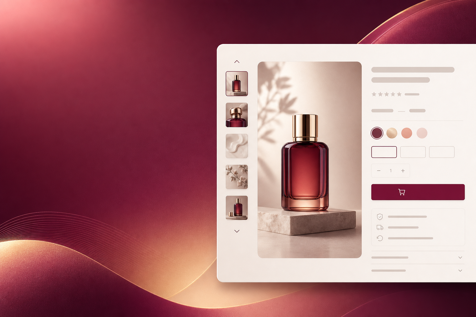
Shopify Product Page Design That Converts — The Complete PDP Anatomy (2026)
1. The Hero Image Gallery: First Impression Is Visual
Users form an opinion about your product in 50 milliseconds. Your hero image gallery is the single most important element on the page — and most Shopify stores get it wrong.
✅ Do This
- Lead with a clean, white-background product shot at high resolution (1200px+ wide)
- Include 5-7 images: front, back, detail, lifestyle, scale/size reference, video
- Use a thumbnail strip or dot indicators so users know how many images exist
- Enable pinch-to-zoom on mobile (Shopify supports this natively)
- Add a product video (under 15 seconds) showing the item in use
❌ Don't Do This
- Lead with a lifestyle shot as the first image — users need to see the product clearly first
- Use low-res, blurry, or inconsistently lit photos
- Upload 20+ near-identical variants of the same angle
- Skip the video — product videos increase conversion by up to 80%
- Forget alt text on every image (crucial for SEO and accessibility)
2. Product Title + Price: The Quick-Yes Test
In under 3 seconds, a visitor should be able to answer: What is this? How much does it cost? If either answer isn't immediately obvious, they bounce.
Title formula: [Brand] + [Product Name] + [Key Differentiator]. Example: "Woolrich Arctic Parka — Waterproof, Rated to -30°F." Not: "Parka Jacket Winter Coat Men Warm Heavy Duty" (keyword-stuffed titles look spammy and hurt trust).
Price display: Show the price prominently in a large, bold font near the title. If there's a sale, show the original price with a strikethrough and the sale price in a contrasting color (red or green, depending on your palette). Add "You save $X (Y%)" — this small nudge measurably increases conversions.
3. Variant Selectors: Don't Make Me Think
Variant selectors are where good product pages go to die. If a customer can't quickly see and select their preferred size, color, or style, they won't struggle — they'll leave.
✅ Do This
- Use visual swatches for colors (not dropdown menus)
- Display size options as tappable pills — at least 44px touch targets
- Show stock status inline: "Only 3 left in Medium"
- Auto-select the first available variant on page load
- Add a size guide link directly next to the size selector
❌ Don't Do This
- Use generic dropdowns for colors — "Navy Blue" in text means nothing compared to a blue swatch
- Show out-of-stock variants without a clear "Sold Out" label
- Make users click through variant options one at a time to check availability
- Hide the variant selector below the fold on mobile
4. Add to Cart Button: The Conversion Engine
The ATC button is the most important 200 pixels on your product page. Every design decision should funnel the user's attention toward this button.
- Color: Use a high-contrast color that's unique to this button — nothing else on the page should share this exact color. Shopify's Dawn theme uses black ATC buttons, which blend with the header. Consider a bold brand color (deep green, burgundy, navy) that stands out.
- Size: On desktop, at least 200px wide and 48px tall. On mobile, full-width and 52px+ tall. This is not the place for subtlety.
- Copy: "Add to Cart" is standard, but test alternatives: "Add to Bag," "Buy Now," or "Add to Cart — Free Shipping." Even small copy changes can lift conversions 2-5%.
- Sticky ATC on mobile: A persistent "Add to Cart" bar fixed to the bottom of the screen as the user scrolls. This alone can improve mobile conversion by 15-25%.
- Dynamic Buy Button: Shopify's dynamic checkout button (Shop Pay, PayPal, etc.) should be directly below the ATC button, not hidden in a corner. Some customers want to skip the cart entirely.
5. Trust Badges + Social Proof: Removing the "Is This Legit?" Question
Every first-time visitor to your product page is silently asking: Can I trust this store? Your job is to answer that question before they even consciously ask it.
Trust badge placement strategy:
- Place payment icons (Visa, Mastercard, PayPal, Apple Pay) near the ATC button — not buried in the footer. "We accept these payment methods" is a trust signal.
- Add a "Secure Checkout" badge with a lock icon near the price.
- If you offer free returns, money-back guarantee, or free shipping, display small icons with one-line descriptions directly below the ATC button.
- Star ratings and review counts should appear near the product title, not hidden in a reviews tab below the fold.
Social proof that moves the needle:
- Real customer photos (UGC) near the image gallery. Even imperfect photos outperform studio shots because they're perceived as authentic.
- "X people are viewing this right now" or "Y sold in the last 24 hours" — these real-time social proof nudges create urgency without feeling manipulative. Apps like Fera and Nudgify do this well.
- Featured review snippets pulled up near the product description, not relegated to a bottom tab.
6. Product Description: Sell the Outcome, Not the Specs
The biggest mistake Shopify merchants make with product descriptions: leading with specifications instead of benefits. No one buys a "600-fill-power goose down jacket." They buy "the warmest jacket you'll ever own — without the bulk."
The proven PDP description structure:
- Hook (1-2 sentences): The emotional benefit. Why this product matters.
- Key features (3-5 bullets): The technical details that support the hook, written as benefits: "Waterproof to 20,000mm — stay dry in a monsoon" not "Waterproof rating: 20,000mm."
- Social proof bridge: "Trusted by 10,000+ hikers."
- Specs (collapsible): Put detailed specs in an accordion below the main description. Buyers who want them will expand it. Buyers who don't won't be overwhelmed.
- FAQ section: Answer the top 3-5 questions buyers have. This reduces pre-purchase anxiety and cuts support tickets.
7. Cross-Sells and Upsells: Right Product, Right Moment
Cross-sells can boost AOV by 10-30% — or annoy customers into abandoning. The difference is relevance and timing.
Effective cross-sell placement:
- Below the ATC button: "Frequently bought together" with 2-3 complementary products and a one-click "Add All to Cart."
- In-cart upsell (via cart drawer or cart page): "You might also like..." after they've committed to the primary purchase. Apps like Rebuy, Zipify, and CartHook handle this elegantly.
- Never put cross-sells above the ATC button. The primary purchase must come first.
- Limit cross-sells to 2-4 items. A wall of 12 "suggested products" is analysis paralysis disguised as merchandising.
8. Mobile PDP: Design for the Thumb, Not the Mouse
Over 70% of Shopify traffic is mobile. Your mobile product page isn't a smaller version of desktop — it needs its own design logic.
- Image gallery: Swipe-able, full-width, with dot indicators. No tiny thumbnails that require precision tapping.
- ATC button: Full-width, sticky to bottom of screen, always visible.
- Description: Show the first 2-3 lines with a "Read more" expander. Full descriptions above the fold push the ATC button off-screen.
- Variant selectors: Large, tappable swatches or pills. No dropdowns on mobile — ever.
- Breadcrumbs: Include them. Mobile users navigate differently than desktop users and rely on breadcrumbs to orient themselves.
The PDP Audit Checklist
Before you publish your next product page, run through this 10-point checklist:
- Is the first product image a clean, high-res, white-background shot?
- Can a first-time visitor identify the product and price in under 3 seconds?
- Are variants visual (swatches) and at least 44px touch targets on mobile?
- Is the ATC button a unique, high-contrast color not used elsewhere on the page?
- Are trust badges (payment icons, guarantees) visible near the ATC button?
- Does the product description lead with a benefit, not a spec?
- Are cross-sells placed below the ATC button, not above it?
- On mobile, is the ATC button sticky and full-width?
- Are there at least 3 customer reviews visible without scrolling to a tab?
- Does the page load in under 3 seconds on a 4G mobile connection?
The product page is the highest-leverage page on your store. A 1% improvement in PDP conversion rate compounds across every visitor, every ad click, every email campaign. It's worth obsessing over.
Need a Product Page That Converts?
I redesign Shopify product pages that turn browsers into buyers. Let's audit your current PDP and build one that converts.
Last updated: June 2026 | Author: Pravesh | pravesh.online