Projects

Seven Shopify stores, one conversion-focused approach.

Healthcare, luxury fashion, beauty, food, wellness, creative agencies, and subscription brands. Each project is a real store I built or rebuilt — with cleaner hierarchy, stronger trust signals, and smoother purchase flow.

The Work

Each project is a real store. Tap any card to read the deep-dive breakdown — what changed, why, and what it did for conversions.

Search or filter by industry below. Every card has a collapsible deep-dive companion.

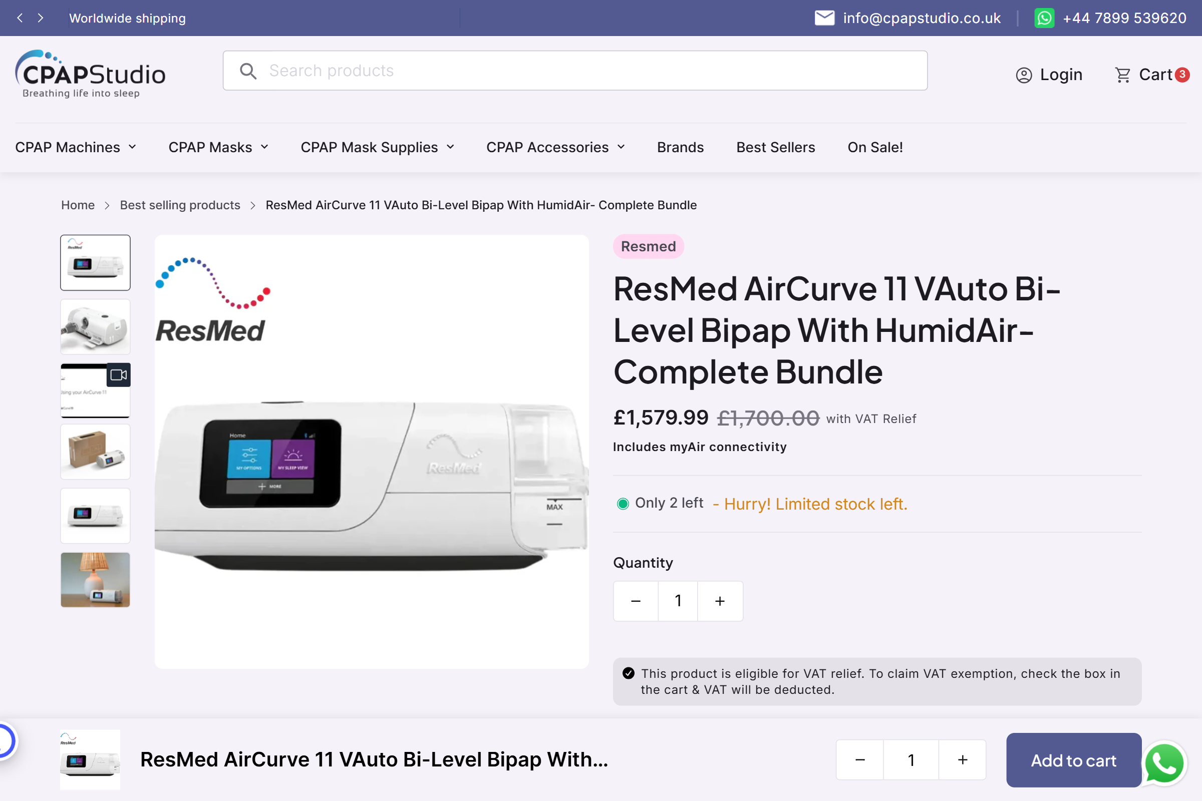
CPAP Studio healthcare commerce screenshot

Healthcare commerce

01

CPAP Studio Healthcare Commerce

A healthcare commerce product experience with clearer hierarchy, stronger trust signals, and smoother purchase flow.

Healthcare storefront Medical devices Trust UX
Read the deep dive

What was wrong

The original product page buried key information — specifications, compatibility, and trust signals — below the fold. Customers had to scroll past marketing copy to find the details they needed to buy.

What changed

  • Restructured product page: specification table moves above the fold on desktop, trust badges appear adjacent to the Add to Cart button
  • Added an insurance compatibility section as a reusable custom Liquid block — store staff can update it without touching code
  • Streamlined mobile checkout: removed unnecessary address fields, added progress indicator, simplified variant selection
  • Integrated video product demonstrations into product pages using a custom section with poster fallback

Result

Sales improved within the first week of going live. Mobile conversion rate climbed as the shorter, clearer checkout flow reduced drop-off. The custom insurance section became one of the most-visited parts of the product page.

Shopify Liquid Custom Sections Product Page UX Video Integration Mobile Optimization
Build a stronger product page →
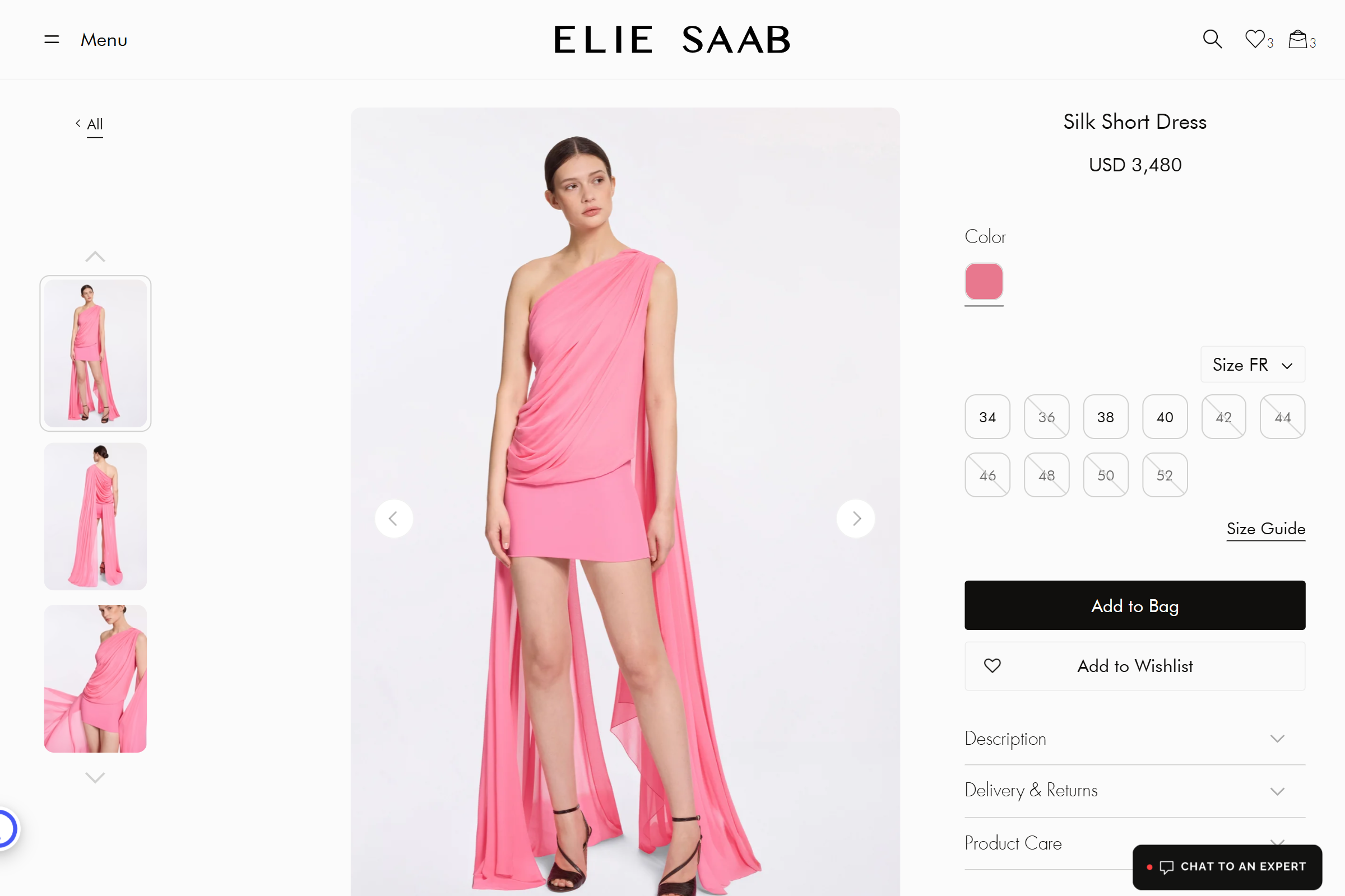
Elie Saab luxury fashion ecommerce screenshot

Luxury fashion

02

Elie Saab

Premium product presentation with elegant whitespace, fashion photography, and a clean interface that lets the product lead.

Luxury UI Elegant layout
Read the deep dive

What was wrong

Product images competed with cluttered sidebars and promotional text. The luxury aesthetic was diluted by functional elements that didn't match the brand's editorial tone.

What changed

  • Built a custom product gallery with elegant transition animations — images fade and slide, no jarring jumps
  • Removed sidebar clutter; moved essential info (size guide, care instructions) into an expandable panel that keeps the product visual dominant
  • Implemented a typography system matching the brand's fashion-editorial guidelines — display type, body copy, and labels all follow a consistent hierarchy
  • Collection pages redesigned with editorial-style grid — featured products get larger emphasis, secondary products stay visible but subdued

Result

Time-on-product-page increased as visitors engaged longer with the cleaner presentation. The editorial grid on collection pages improved browsing experience and reduced bounce rate.

Luxury UI Typography System Image Optimization Collection Layout
Create a premium store experience →
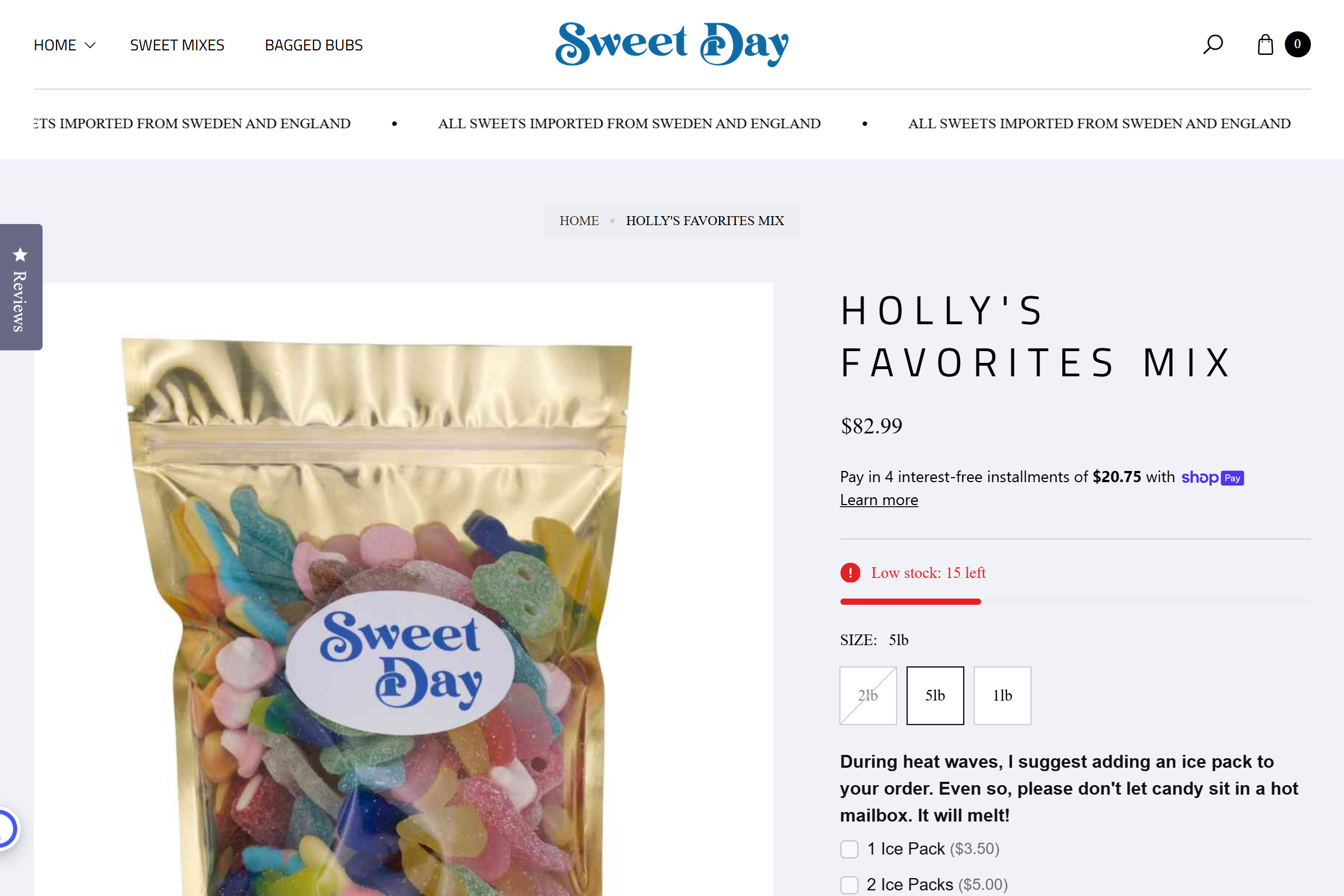
Sweet Day product page screenshot

Food and candy store

03

Sweet Day

A product page built around packaging visuals, urgency cues, and a friendlier ecommerce flow for quick product decisions.

Product storytelling Stock messaging
Read the deep dive

What was wrong

Packaging — the store's biggest visual asset — was cropped and undersized on product pages. Stock information was buried. The purchase flow felt clinical, not playful.

What changed

  • Product page built around a large packaging hero image — the packaging is the hero, with flavor details and description below
  • Added low-stock urgency messaging that appears dynamically based on inventory levels — "Only 12 left" with animated count
  • Quick-add to cart with inline variant selection — customers pick flavor and quantity without leaving the product page
  • Related products carousel showing complementary flavors — cross-sell built into the product page, not an afterthought

Result

Product page conversion improved as packaging visuals and urgency cues drove purchase decisions. Related products carousel increased average order value through natural cross-selling.

Product Storytelling Urgency UX Cross-selling Variant Selection
Improve your product page UX →
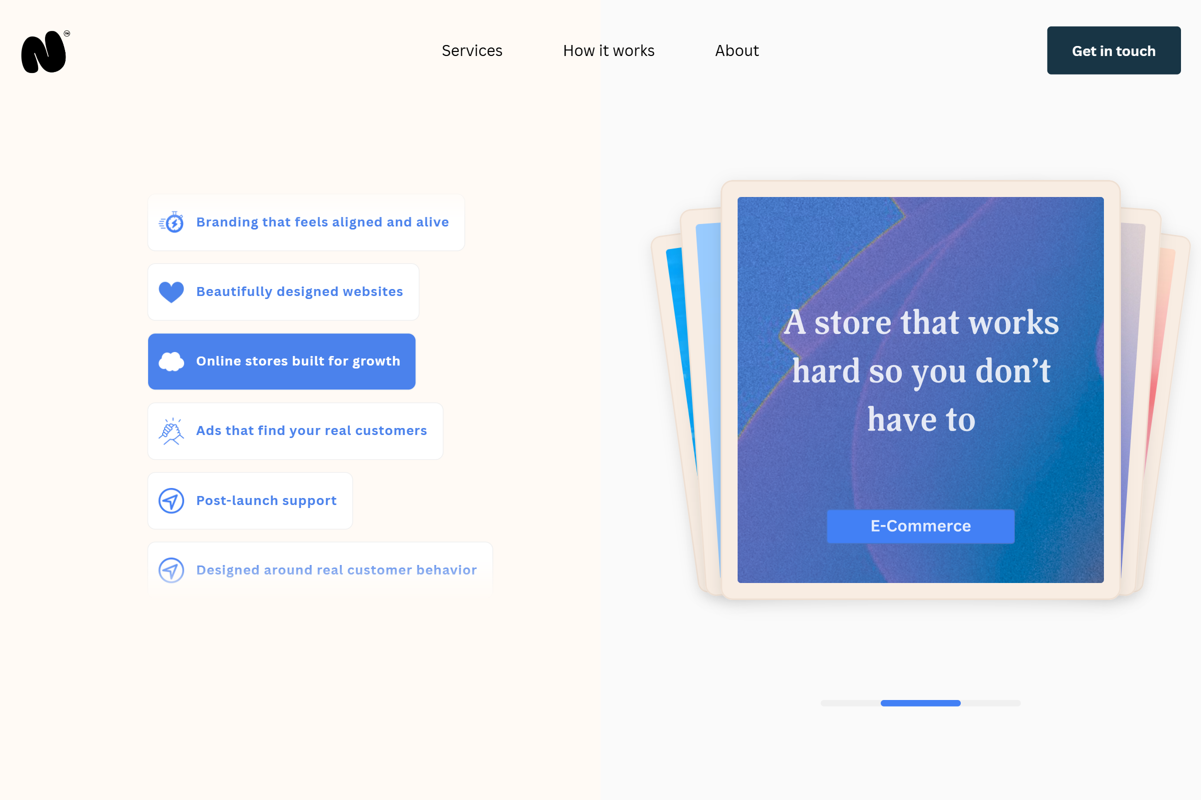
Navasard Studio website screenshot

Creative service website

04

Navasard Studio

A more expressive layout approach with layered cards, soft motion, and interactive content blocks that feel more editorial.

Interactive layout Motion-focused UI
Read the deep dive

What was wrong

The agency site was functional but flat — a grid of content blocks with no personality. Creative work deserved a more expressive, layered presentation that matched the studio's own design sensibility.

What changed

  • Built a layered card-based layout system — content blocks overlap, stack, and reveal on scroll with CSS animations
  • Added hover interactions on portfolio items — cards lift, images zoom subtly, project tags appear on hover
  • Interactive portfolio filtering — visitors click a category tag and the grid filters with a smooth reorder animation
  • Editorial-style typography with custom font pairing — display headings in a premium serif, body copy in a clean sans-serif

Result

The site became a showcase for the studio's design capabilities — every interaction reinforces the creative brand. Portfolio filtering improved findability without cluttering the page.

Interactive Layout CSS Animation Motion Design Typography
Add interaction to your storefront →
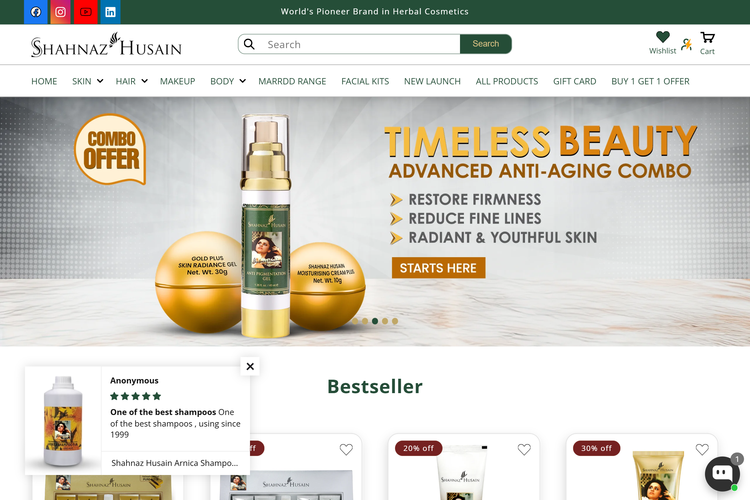
Shahnaz Husain ecommerce homepage screenshot

Beauty ecommerce

05

Shahnaz Husain

Campaign-led homepage structure with stronger product grouping, offer visibility, and a more polished beauty brand presence.

Homepage revamp Campaign design
Read the deep dive

What was wrong

The homepage was a flat list of products and promotions — no campaign structure, no visual hierarchy. Offers were buried and product categories had no clear grouping.

What changed

  • Restructured homepage into campaign-led sections — seasonal promotions get their own hero area, new arrivals get a dedicated block, bestsellers get featured placement
  • Added visual product category navigation — banners with imagery guide customers to the right category immediately
  • Offer visibility improvements: discount badges on promotional products, countdown timers on limited-time offers, clear callout banners for site-wide sales
  • Brand-aligned color system and typography — warm, natural tones matching the beauty brand's heritage, with consistent type hierarchy across all sections

Result

Homepage became a true storefront entrance — customers immediately see what's new, what's on offer, and where to go. Campaign sections drove higher engagement with seasonal promotions.

Homepage Revamp Campaign Design Brand System Offer Visibility
Refresh your homepage design →
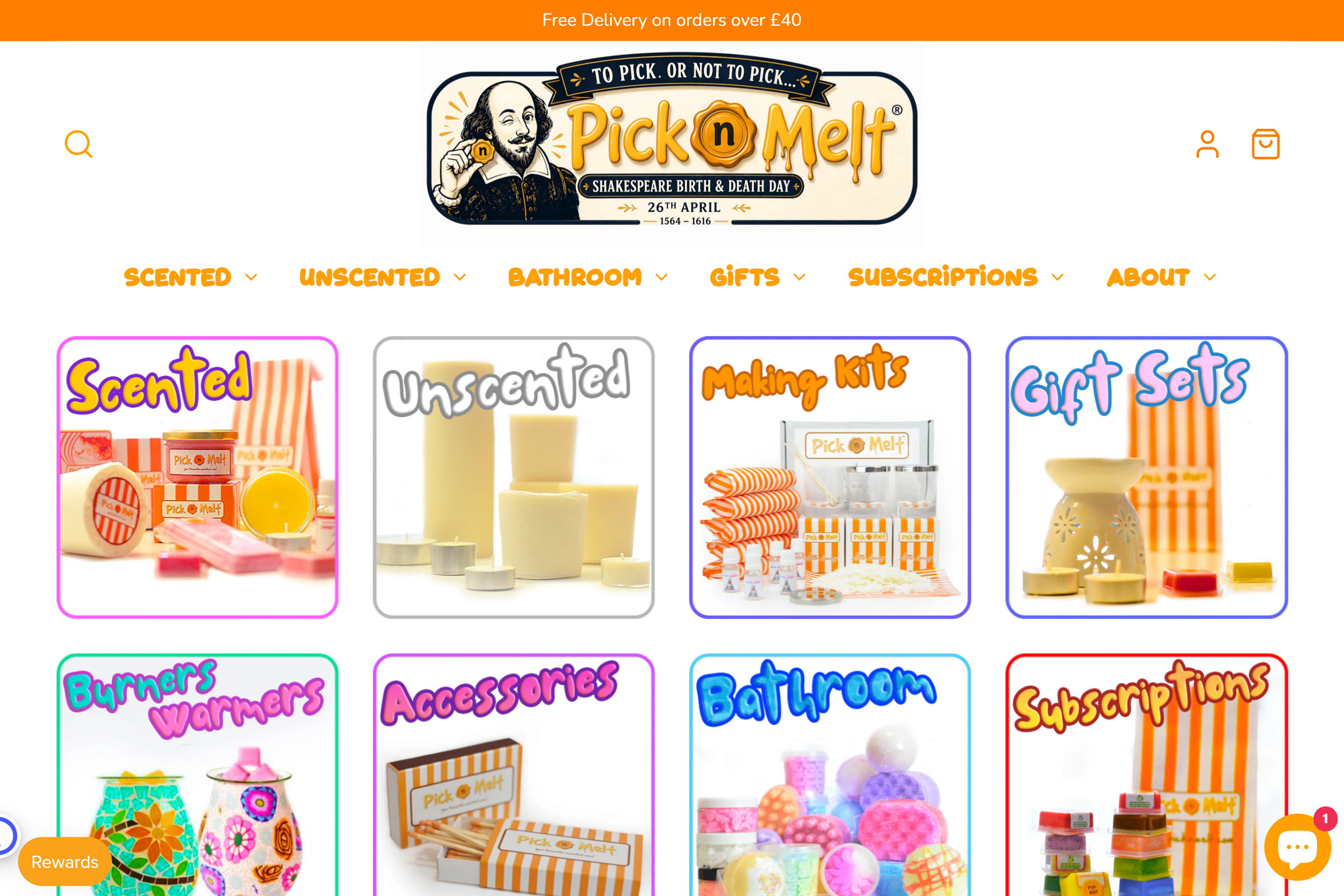
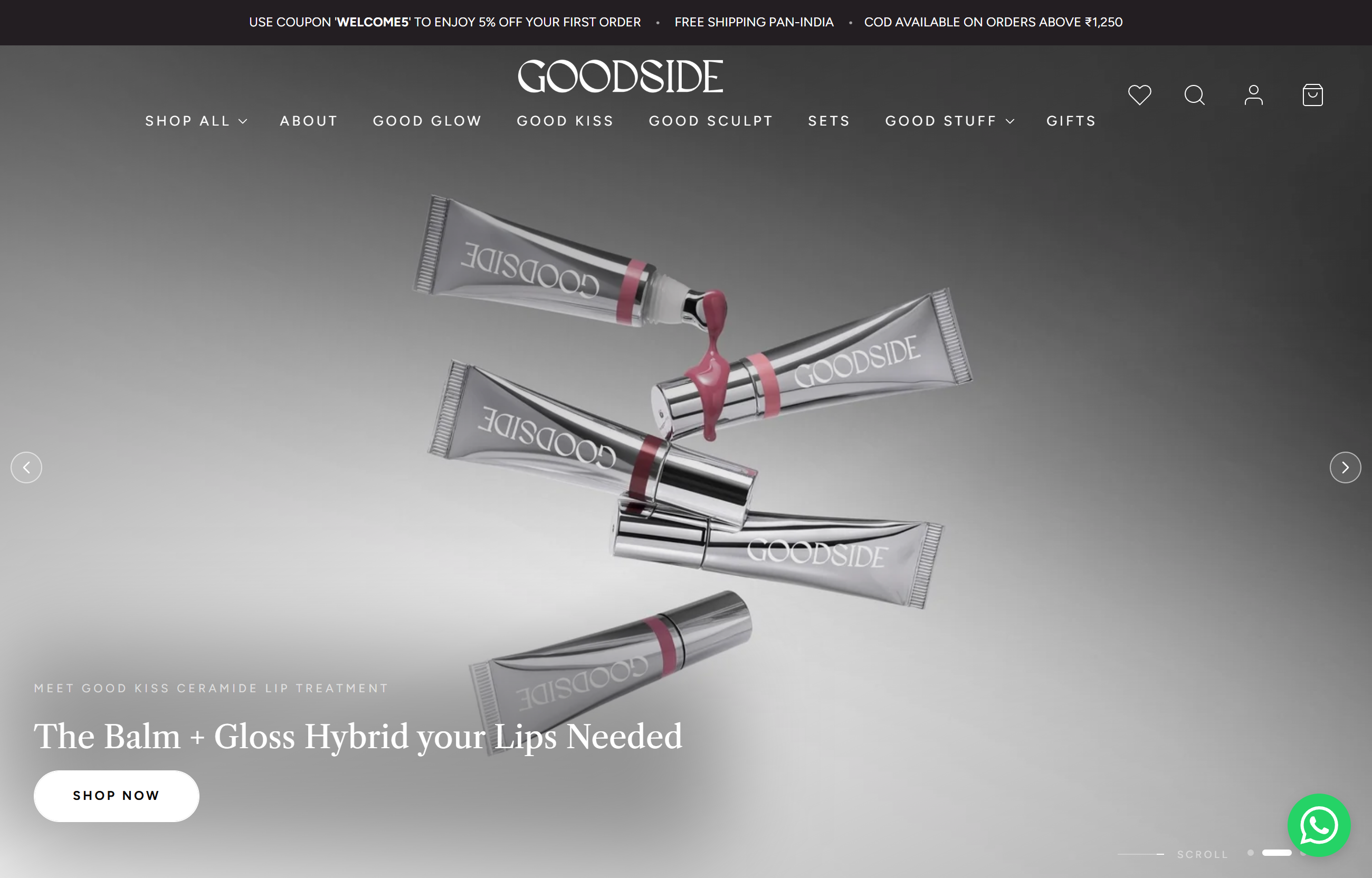
Pick n Melt ecommerce category screenshot

Gift and subscription store

06

Pick n Melt

Bright category-led merchandising with bold product discovery blocks and a more playful browsing experience.

Collection design Merchandising UI
Read the deep dive

What was wrong

The category page was a generic grid — no personality, no guidance. Gift shoppers needed help discovering products, not just browsing a flat list.

What changed

  • Category-focused collection page redesign — each category gets a visual identity with custom hero imagery and curated product highlights
  • Mega menu with visual category navigation — customers see product categories with images before they click, reducing wrong turns
  • Built a gift finder quiz using custom JavaScript — customers answer a few questions and get personalized product recommendations
  • Playful brand-aligned UI elements — bold colors, fun micro-interactions, product discovery blocks that feel like browsing a curated selection

Result

Category pages became destinations, not just grids. The gift finder quiz drove discovery for customers who weren't sure what to buy. Mega menu reduced navigation friction.

Collection Design Custom JS Merchandising UI Navigation
Upgrade your collection layout →
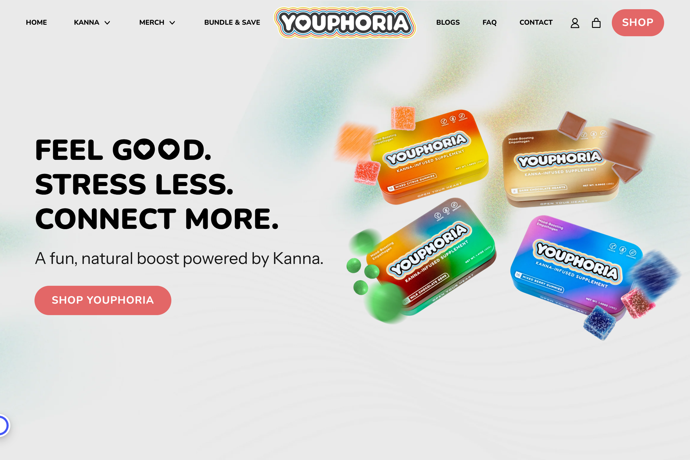
Youphoria homepage ecommerce screenshot

Wellness ecommerce

07

Youphoria

A bold hero-led homepage with colorful product presentation, cleaner branding hierarchy, and stronger first-impression storytelling for a modern wellness brand.

Homepage hero Brand-led layout
Read the deep dive

What was wrong

The homepage didn't communicate the brand's personality — it looked like a generic ecommerce template. Wellness shoppers buy into a lifestyle, and the store needed to tell that story immediately.

What changed

  • Full-width hero section with brand video background — sets the tone immediately, shows the product in use, communicates the wellness lifestyle
  • Product benefits section with icon-driven layout — each benefit gets an icon, a short headline, and a one-line explanation; scannable and attractive
  • Ingredient highlighting section — transparency badges show key ingredients and their benefits; builds trust with informed wellness shoppers
  • Mobile-first design — the homepage was built for mobile first, then scaled up; wellness shoppers are predominantly mobile

Result

First-impression storytelling strengthened — visitors immediately understand the brand's wellness positioning. Icon-driven benefit section improved scannability and engagement. Mobile-first approach matched the audience's behavior.

Homepage Hero Brand Storytelling Mobile UX Icon Design
Create a high-impact homepage →